How to View Category Totals in Airtable Without Manually Filtering
You want to see the total for each category: total revenue by region, number of tasks by status, total inventory by product type. Without any setup, you would need to filter the view to each category one by one and read the summary bar each time.
There is a faster way that shows all category totals at once.
Method 1: Group by Category and Read Summary Bars
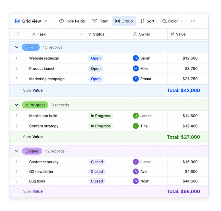
The built-in approach is to group the view by the category field. When records are grouped, each group has its own summary bar that shows totals for numeric fields within that group.
- Open a grid view
- Click the Group button in the toolbar
- Select your category field (Status, Region, Type, or whatever field defines your categories)
- Records now appear in collapsed or expanded groups, one per category value
- In each group, use the summary bar to choose the calculation you want to display, such as Sum, Average, Count, Min, or Max
Each group's summary bar shows the total, average, count, min, or max for any numeric field within that group. You can see all category totals simultaneously without switching views or applying filters.
This approach is purely visual and requires no additional setup beyond the grouping. The numbers update in real time as records change.
Method 2: Summary Table Using Rollup Fields
If you need the category totals available as data rather than just as a visual display (for example, to use them in a formula, show them in an Interface, or compare them over time), build a summary table.
Setup:
- Create a new table called Category Summary
- Add a Name field (single line text) with one record for each category: "North", "South", "East", "West" for regions, or "Open", "In Progress", "Closed" for statuses
- In your main data table, add a linked record field pointing to the Category Summary table. For each record, link it to the correct category.
- In the Category Summary table, add a Rollup field. Set it to roll up through the linked field and calculate SUM, COUNT, or AVERAGE of the relevant field in the main table.
Now each row in the Category Summary table shows the total for that category, always up to date.
Rollup fields only work through linked records. If your categories are currently stored in a single select field, you will need to convert the field to a linked record.
The linked record approach requires your main table to explicitly link each record to its category. This is more setup than grouping, but it gives you category totals as a first-class field value you can use anywhere.
Method 3: Interface Chart for a Visual Summary
One of the easiest ways to present category totals in a dashboard is with an Interface chart. Airtable's bar chart and pie chart elements summarise data by a grouping field automatically without requiring a separate summary table.
- Open or create an Interface page
- Add a Chart element (bar chart or pie chart)
- In the chart settings, set the X axis to your category field
- Set the Y axis to the field you want to total (Revenue, Count, etc.)
- Set the aggregation to Sum, Count, or Average
The chart shows one bar or slice per category, with the total calculated automatically. It updates in real time as records change in the underlying table.
For comparing category totals across time periods (this year vs last year), see how to compare records across financial years in an Airtable Interface chart for the setup that handles year-over-year comparisons.