How to Compare Records Across Financial Years in an Airtable Interface Chart
Airtable's Interface charts can group and compare data across time periods, but they do not have a built-in "financial year" option. The date grouping options in charts are calendar-based (month, quarter, year).
If your financial year runs from April to March, or July to June, the built-in grouping does not match your reporting periods.
The workaround is a formula field that calculates each record's financial year from its date, then use that formula field as the chart's grouping dimension.
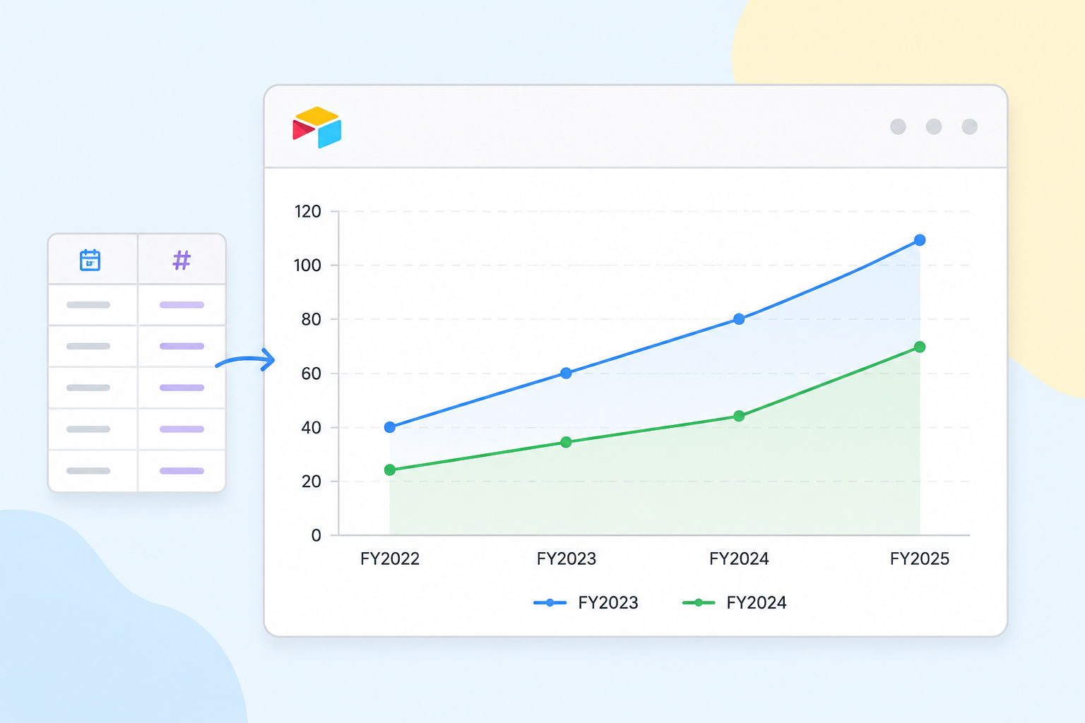
Step 1: Add a Financial Year Formula Field
Add a new formula field to your data table. Name it something like Financial Year.
The formula needs to return a consistent label for each financial year. Avoid a bare year number like "FY2025" on its own, since organizations disagree on whether that means the year the FY starts or the year it ends.
A range like "FY2025-26" is unambiguous either way: it's the financial year that starts in 2025 and ends in 2026, no matter how your organization normally talks about it.
For example, with an April to March financial year:
| Date | Financial Year | FY Month |
|---|---|---|
| 15 Apr 2025 | FY2025-26 | 1 |
| 10 Jul 2025 | FY2025-26 | 4 |
| 20 Jan 2026 | FY2025-26 | 10 |
| 5 Apr 2026 | FY2026-27 | 1 |
For a financial year that runs April to March:
IF(
 MONTH({Date}) >= 4,
 "FY" & YEAR({Date}) & "-" & RIGHT(YEAR({Date}) + 1 & "", 2),
 "FY" & (YEAR({Date}) - 1) & "-" & RIGHT(YEAR({Date}) & "", 2)
)
This returns "FY2025-26" for any date from April 2025 to March 2026.
For a July to June financial year:
IF(
 MONTH({Date}) >= 7,
 "FY" & YEAR({Date}) & "-" & RIGHT(YEAR({Date}) + 1 & "", 2),
 "FY" & (YEAR({Date}) - 1) & "-" & RIGHT(YEAR({Date}) & "", 2)
)
Adjust the month number (>= 4 for April start, >= 7 for July start, >= 10 for October start) to match your financial year.
Replace {Date} with the name of your actual date field.
Optionally, format the formula field's output as Single select. Open the field's Formatting tab and toggle on "Change formula output to single select options," then add each FY label you expect (FY2024-25, FY2025-26, and so on) as an option.
This isn't required for the field to work as a chart grouping dimension, a plain text formula output works fine for that too. But it gives each financial year a consistent categorical value, which is useful if you also want to use it in an Interface dropdown filter.
Step 2: Build the Interface Chart
Open or create an Interface page with a chart element.
For a straightforward year-to-year total comparison, a bar chart works well:
- Set the chart type to Bar chart.
- Set the X axis to your Financial Year formula field.
- Set the Y axis to the numeric field you want to compare (Revenue, Count, Score, etc.).
- Set the aggregation to Sum, Average, or Count depending on your metric.
This gives you one bar per financial year, side by side.
For a month-by-month comparison across years, where you want this year's trend line against last year's at the same relative point in the year, you need a second formula field for month position within the financial year:
MOD(MONTH({Date}) - 4 + 12, 12) + 1
(Replace 4 with your financial year start month number.)
This returns a number from 1 to 12, where 1 is the first month of your financial year. The sequence stays in the right order regardless of which calendar months it spans.
With that field in place, set the chart's X axis to FY Month, and the Y axis to your metric with the aggregation you want.
Use the Group by option in the chart's Data settings to select your Financial Year field. This produces one line per financial year plotted across FY months 1 to 12, side by side for comparison.
Group by is the setting to use here rather than adding separate Y-axis series manually. Airtable's multi-series option requires each series to be bound to its own field, and Airtable doesn't allow using Group by and multi-series Y-axis series on the same chart at the same time. Group by is what gets you a dynamic line per financial year from a single field.
One usability note: your X axis will show 1 through 12 rather than month names, which is correct for sorting but not obvious to read at a glance. Either make clear in the chart title that 1 is the first month of your financial year, or add a second formula field that converts the number to a month abbreviation for display.
If you go the display-field route, test it in your own Interface first. Sorting a chart by month name instead of month number risks sorting alphabetically instead of chronologically, which would scramble the order you're trying to preserve.
Step 3: Filter the Chart to the Periods You Want
In the chart element settings, add a filter to limit the data to the financial years you want to compare. For example, filter where Financial Year is one of FY2024-25, FY2025-26. This keeps the chart readable rather than showing every historical period.
If you want users to be able to select which years to compare interactively, add a dropdown filter element to the Interface page connected to the Financial Year field. Viewers can then choose which years appear in the chart without editing the Interface configuration.
For more on building category-level comparisons in charts without switching views, see how to view category totals in Airtable without filtering for the related pattern of summarising by group.